A few days ago a good friend of mine forwarded me the product brochure of a Structured Product. The product was marketed with the following justification :
Back testing of the product performance has shown that:
(i) There is a 81.02% probability that the absolute returns of the product will be 60% and above.
(ii) There is a 99.86% probability that the absolute returns of the product will be positive.
The marketing material further presents a pay-off structure (given in the graph below) of the product and compares it against the NIFTY.
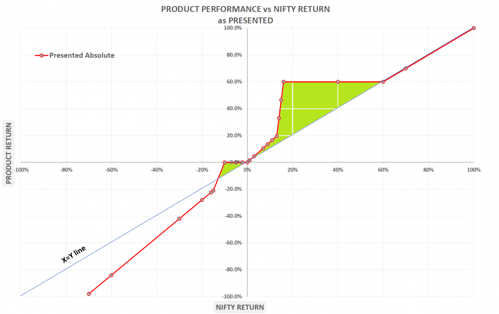
The green shaded area is the region where the product outperforms the NIFTY.
Given the above information how should an investor go about his analysis and come to a conclusion on whether this product is suitable or not ?.
Benchmarking and Inversion:
Normally in such situations, I first examine the statements provided by the marketing material and assume they are true and try to understand the situation through benchmarking. For example statement 1 above says there is a 81.02% probability that absolute returns of the product would be 60% and above. A 60% return over a period of 1160 days (period of the product) amounts to an annualized return of 15.93%. How would this compare against a typical NIFTY return ?. Statement 2 says there is a 99.86% probability that absolute returns of the product will be positive. Again what is the probability that the NIFTY over a 3 year period would give a positive return. Surely one needs to juxtapose the probabilities provided to us against the benchmark which is the NIFTY in this case.
I also try to invert. For example statement 2 above mentions the probability of achieving a non-negative return as 99.86%. That means a negative return is achieved 0.14% of the time. This is a seemingly very small probability and tends to mean that the investor is significantly protected on the downside. But what is not mentioned is in the scenario of achieving a negative return, what is the magnitude of the negative return ? After all probabilities alone are insufficient. Probabilities have to be multiplied by the magnitude of the outcomes to provide the so called EXPECTED outcome (this is Probability 1.0 from our college days).
Questioning the benchmark and product cost:
The benchmark mentioned above is the NIFTY price index. The NIFTY price index ignores dividend income which adds about 1.5% of return every year. Furthermore it is mentioned in the fine print of the marketing brochure that a 2% upfront fee is chargeable. Both these have to be taken into account when understanding the actual product performance. In the below chart the two points mentioned above have been taken into account and the pay-off graph has been redrawn.
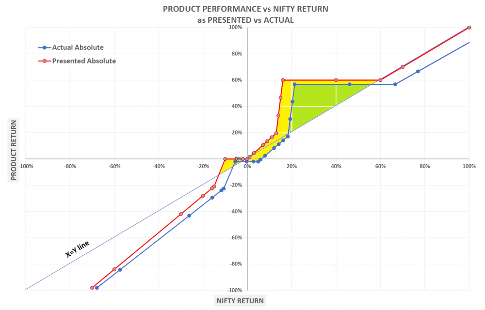
The green shaded area is the region where the product actually outperforms and the yellow shaded area is the area which was originally included in the product marketing material but excluded after correcting for product cost and dividend income in the NIFTY. My approximate calculation indicates that the area of outperformance has halved after the corrections)
Now that we have the true pay-off structure of the product (blue graph), let us examine it and understand what it says.
Outperformance region:
The blue graph indicates that the product outperforms the NIFTY in the region where the NIFTY generates an absolute return between 20% and 55%. In all other regions the product underperforms. What this means is that an investor in this product is betting that the absolute return of the NIFY in the period of interest (1160 days) will be between 20% and 55%. On an annualized basis this is equal to a range between 5.9% to 14.80%. Any return in the NIFTY above or below this range will result in underperformance of this product versus the NIFTY.
Maximum upside:
The green shaded region indicates that the maximum upside in the product happens when the NIFTY touches an annualized return of 5.9%. At this point the product is generating an annualized return of about 15% giving an annualized alpha of 10%.
Maximum Downside:
A close inspection of the bottom left quadrant of the graph indicates that when the NIFTY generates increasingly negative returns, the blue graph performs even worse (look at the blue graph as compared to the X=Y line), i.e the product underperformance continues to accelerate. In other words, the downside of this product is significantly worse than the downside of the NIFTY. The maximum underperformance of this product could be as high as -40% annualized - and this happens when the NIFTY is generating negative return.
Who should buy this product?
An investor who believes that the prospective NIFTY annualized return will be in the range of between 5.9% and 14.80% and is ready to risk a significantly worse downside than the NIFTY when the NIFTY generates negative return. If the investor's punt comes true, a maximum alpha of 10% annualized is realized and if it does not, then the range of annualized underperformance of the product is in the range of 0% to -40%. An investor ready to accept these outcomes may invest in this product. In my opinion this is an unnecessarily complicated product. Investors are better served through investing directly in a NIFTY index fund with low service costs (0.1%). In such a strategy, the investor will simply get the NIFTY return over the entire spectrum of NIFTY performance. This structured product on the other hand gets higher returns in a narrow range and significantly lower returns outside this narrow range.