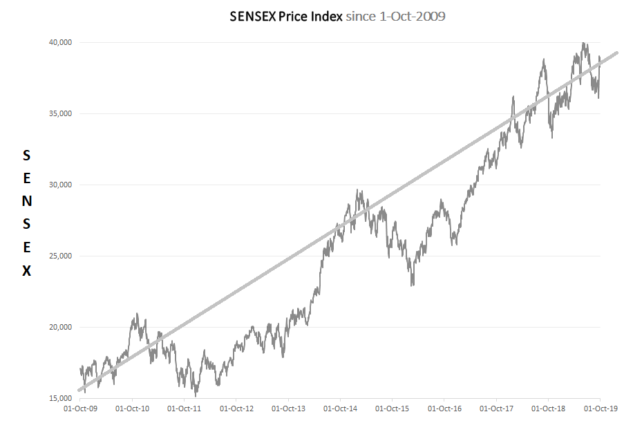
It is pretty standard for “investment experts” to say that the long term “average” expected return from equity investments in India would be around 12%. Investors, I would dare say are not just blind but blinded (by the financial community – of which yours truly is a part of) to the fact that the path along this “average” 12% return is riddled with multiple unseen pot-holes, deep ravines and sharp ridges. How can investors be informed appropriately and be made to appreciate the risks that entail equity investing – or for that matter the risks in any investment opportunity ? We start with the below Graph-1 which has the value of the BSE SENSEX Price Index since 1-Oct-2009.
Graph 1
The BSE SENSEX Price Index shows a long term steady gain with some short term fluctuations. The typical investor has seen this kind of a chart innumerable number of times. She realizes that the climb from 15,000 to 40,000 in the BSE Price Index is not a smooth line, but in-fact has some oscillations around a steady upward trending line. The investor is comforted and believes she can surely stomach these oscillations. The incessant upward march of the BSE SENSEX Price Index is comforting. It feels that there is an inherent resilience in the BSE SENSEX Price Index – that come what may, temporary blips can be overcome.
We have in multiple blogs referred to the idea of understanding the maximum downside – and how we can use the concept of maximum downside, to decide the allocation to risky equity investments. An idea around this maximum downside is the Maximum Drawdown. The definition of the Maximum Drawdown of an investment is the maximum absolute downside since the previous highest value point of an investment. When we superimpose the Maximum Drawdowns the BSE SENSEX Price Index has witnessed since 1-Oct-2009 a different picture emerges.
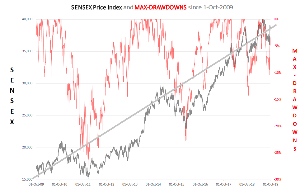
Graph 2
Graph-2 above has two charts in it. The first chart in black, is identical to the chart in Graph-1 and represents the BSE SENSEX Price Index. The second chart in red, which must be read-off the right axis, represents the Maximum Drawdowns (in %) of the BSE SENSEX Price Index. The wild oscillations in the red graph, showing at times a drawdown of -28% evokes a visceral gut wrenching feeling from within. How will the investor’s perception of risk in the BSE SENSEX Price Index change when the focus moves from Graph-1 to Graph-2 ? The resiliance of the BSE Price Index vanishes when confronted with this grim reality faced by investors in the BSE SENSEX Price Index in the past. The red graph present a more realistic picture of what we are likely to experience as we coast along the BSE SENSEX Price Index ride.
I would like to picture the red chart in Graph-2 as akin to extremely dangerous terrain that we must cross on foot. How would you cross this if you are not tall enough for the deeper portions of the terrain AND you have absolutely no clue as to which portions are shallow and which are too deep for you ? One way is to cross the river by feeling the stones – a famous quote from Deng Xiaoping – the architect of modern China when asked how will communist China transform into an economic power house (which it is today) - a pragmatic, grounded and incremental approach in the face of uncertainty. The approach implies a humbleness, an acceptance of the fact that we do not know many things and that we better be on all our fours to navigate this difficult and uncertain terrain.
It must be emphasized, that the terrain depicted by the red graph is of the Maximum Drawdowns in the BSE SENSEX Price Index - in itself a diversified composite of 30 stocks. The terrain for individual stocks can look a whole lot more dangerous and it would not be an understatement to state that it could be - simply vicious.