with
Vikram Saravanan
3rd Year Student of Economics and Finance
University of Bristol
and
Sundar Sivalingam
2nd year student
James Cook University, Singapore
We have analysed the 5-year rolling returns of a few prominent Aggressive Hybrid Funds in India. These rolling returns have then been converted to excess returns by subtracting benchmark returns over the same 5-year rolling period. We have proceeded to conduct an attribution analysis using the Brinson method on the stand out fund to determine whether its performance is driven by asset allocation or security selection. Our analysis covers the period from July 2015 to July 2025. Our metric is the 5-year rolling excess return. Our benchmark is a composite hybrid benchmark comprising 65% Equity and 35% Debt; we use monthly rolling returns for the quadrant calculations for the Brinson model for attribution analysis. Source of data includes fund fact sheets taken from the respective mutual fund websites, benchmark values consisting of NIFTY-50 TR and NIFTY 1D RATE INDEX taken from the nifty indices historical data website. The Benchmark composition is 65% of the NIFTY 50 TR and 35% of the 1D RATE INDEX. We chose this benchmark as it is similar to what was being compared to in the respective funds report.
The 5-year rolling returns of the funds versus the benchmark is presented below:
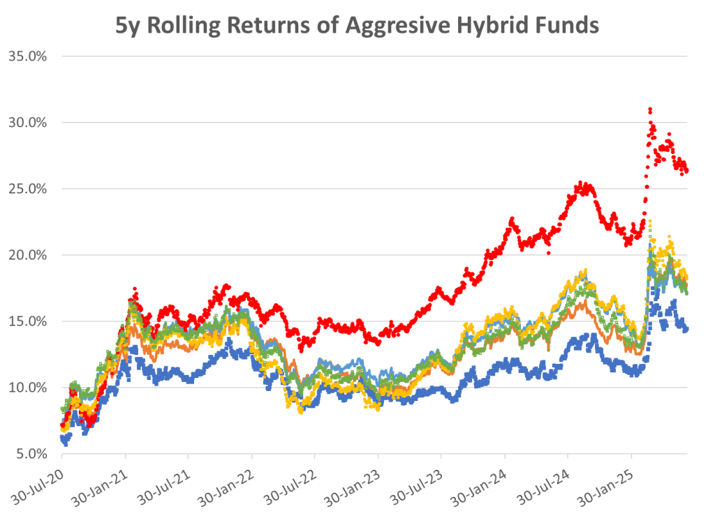
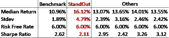
The chart indicates that all the funds beat the benchmark most of the time with one fund standing out (red dots). Interestingly tabulation of the median returns and standard deviations and Sharpe ratios indicate, the stand out fund (red dots) has a poor Sharpe Ratio in spite of having the highest return – implying its risk-reward ratio is probably inferior to the other funds (including the benchmark !!):
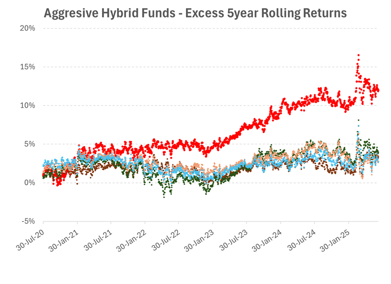
To get more insight, the 5y ear excess rolling returns were replicated after subtracting benchmark returns over the same period for each of the funds. A line chart of the 5-year rolling excess returns versus date shows that the one fund (red dots) again clearly stands out, in that it not only generates higher excess return but also seems to have a higher variability in this excess return. The other funds are tightly packed together in a bunch and stick together through the entire time period.
Box & Whisker Analysis of excess returns
To understand the reliability of these excess returns, we analysed the distribution spread using a Box and Whisker plot. As expected, the stand out fund has the longest box and longest whiskers, which shows that it has the widest dispersion of returns. The gap between its best 5-year period and its worst is significant. This is a fund for investors who are able to tolerate a lot of variances.
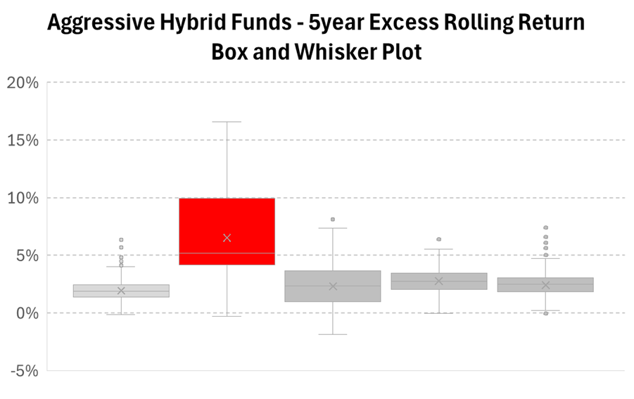
The other funds exhibit much shorter boxes, which indicates highly predictable outcomes. Investors who bought these funds have a largely uniform experience regardless of when they bought in. As for the median performance, the median line for the stand out fund is well above the upper quartiles of its peers. The stand out fund’s average day is better than the best days of most of the other funds. The wide whiskers imply a strategy that deviates significantly from the mean, whereas the rest of the funds have a more consistent average. Investors in the stand out fund need to accept higher volatility for higher returns, while the other funds offer smoother but less lucrative returns.
Attribution analysis – Allocation vs. Selection for the stand out fund:
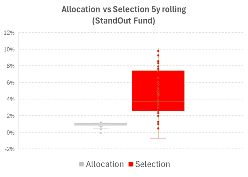
For the stand out fund, we took a deeper look to understand how it generates these excess returns. Using the Brinson method, we broke down the 5-year rolling excess returns into two components viz: (i) Allocation Effect i.e. excess returns generated by overweighting or underweighting Asset Classes (Equity vs. Debt) and the (ii) Selection Effect, which is excess returns generated by picking superior securities within those asset classes.
The chart below shows that selection explains nearly all the reasons for the stand out fund being different. The Box and Whisker plot for selection shows a median contribution of ~3.7% to 4.7%, with highs reaching 10.1%. Most of the fund’s return and volatility comes from the manager’s security selection. Whereas for allocation, the box is extremely compressed, with an average contribution to excess returns of ~1.0%. This indicates that the fund’s allocation model contributes positively but marginally compared to stock selection.
With this analysis we come to the following conclusions:
- The stand out fund generates higher return accompanied with higher volatility
- The other funds have more predictive excess returns, but these returns are muted compared to the stand out fund.
- The primary source of the higher return and volatility of the stand out fund comes from security selection.
- It seems likely that the stand out fund has chosen a riskier segment of equity to invest in as compared to the other funds – and hence has generated a higher excess return at the cost of higher volatility.
- Investors must carefully analyse the trade-offs involved in choosing the stand out fund i.e. excess returns versus higher uncertainty. In times of market euphoria, investment in the stand out fund could result in future disappointment.
Disclaimer: We have made multiple assumptions during our calculation, of which one significant is that there is no interaction between selection and allocation.